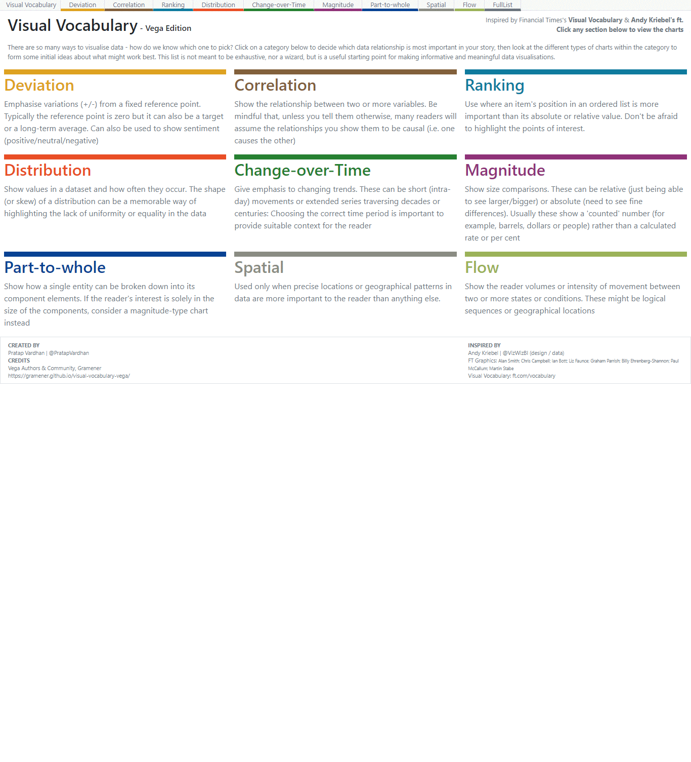
FT Visual Vocabulary with Vega
There are many ways to visualize data - how do we know which chart to pick?
Visual Vocabulary guide from The Financial Times’s Graphics team is one answer
- was created to help their team to pick the right type of visualization for their story.
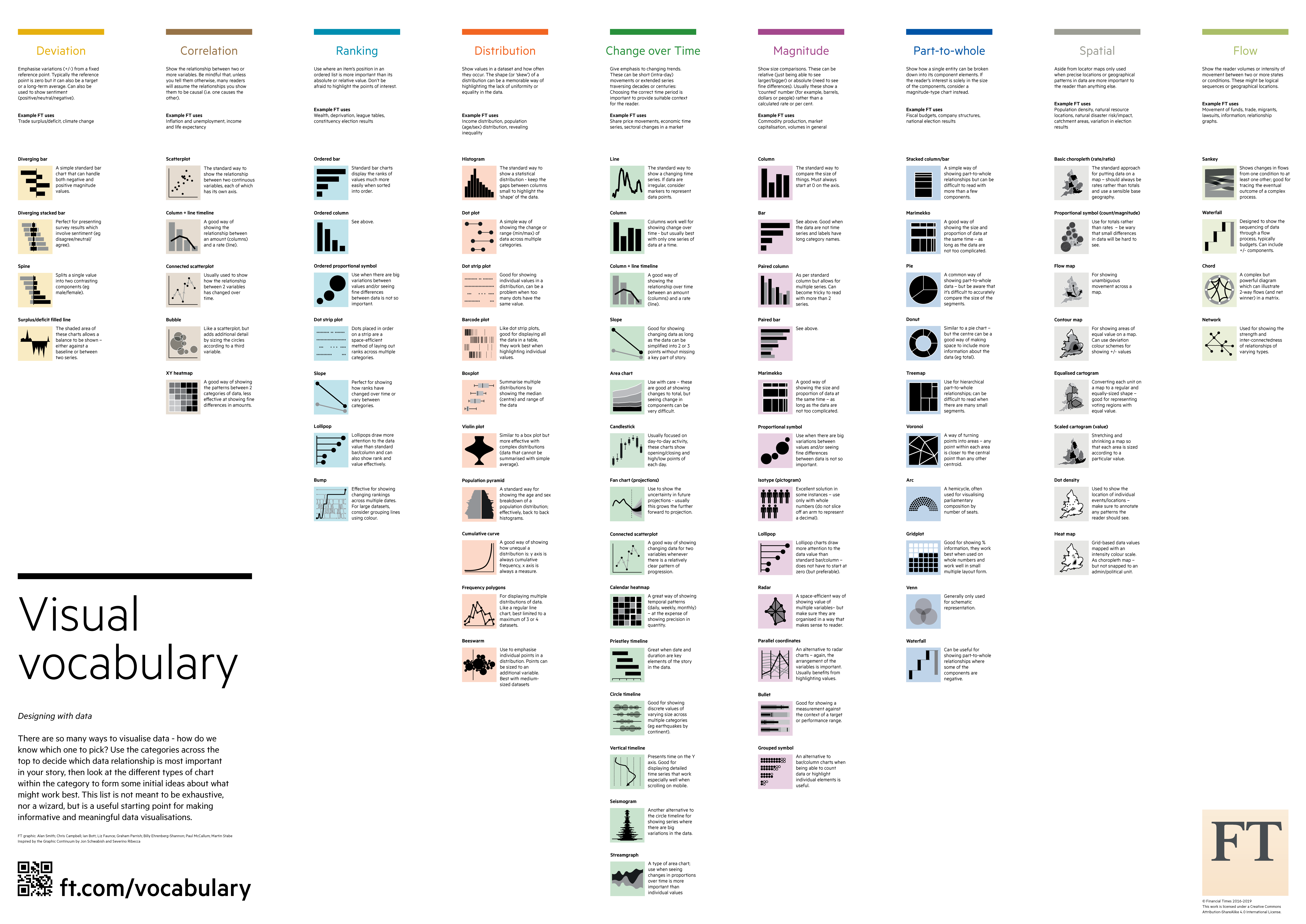
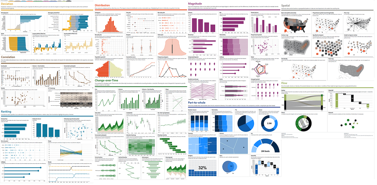
72+ charts types are divided into 9 categories
- deviation, correlation, ranking, distribution, change over time, magnitude, part-to-whole, spatial and flow.
Vega Edition
Last month, I started building these charts in Vega
- as a useful guide and source of re-useable charts for vega users.
Vega is a visualization grammar, a declarative language for creating, saving, and sharing interactive visualization designs. With Vega, you can describe the visual appearance and interactive behavior of a visualization in a JSON format, and generate web-based views using Canvas or SVG.
These collection of ~73 charts were released this month with code. Try it out!
View tweet
Credits
The original design and motivation was from Andy Kriebel’s Tableau edition creation. I’ve liberally re-used design, data from his work!
Click on the gif below to try the interactive version. You can edit the underlying chart in vega editor. And, do share your feedback or contribute.